A Maze of Storage Cages
As part of the ongoing process of moving across town, I had reason to use the basement storage space provided by the landlord to each resident in the new building. But first, I had to locate the numbered storage cage I was supposed to use. This turned out to be harder than expected, when my expectations were turned upside down.
(You'll have to excuse the shitty photography in this article. I'm still in the process of moving and have a lot on my plate.)
Down the Rabbit Hole
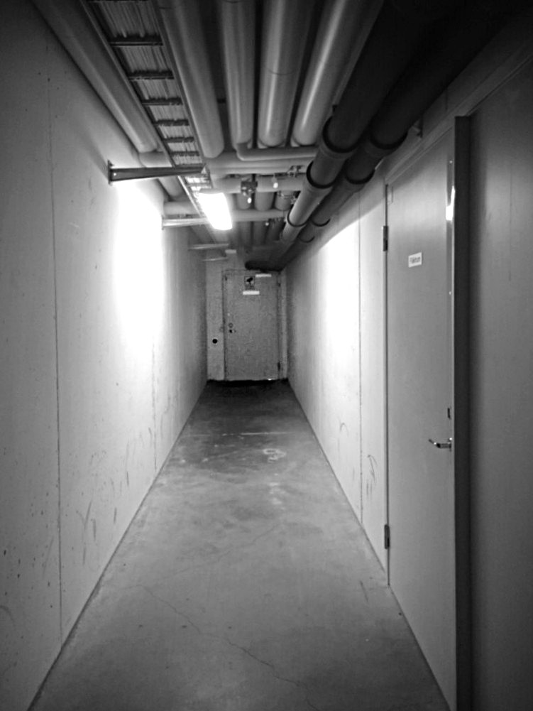
The first time I went down to that basement I was struck by how big the place was. I spent well over 15 minutes trying to find the cage with the correct number. After 10 minutes, I was slightly worried I wouldn't even find my way back out again. I'm used to be able to clear out these basement storage spaces in less than two minutes. Either way, I finally found the right cage by luck, not some kind of cleverness.
I expected to have to suffer through the same kind of time to find my way back to the exit. After just three turns – maybe 30 feet, there it was. The cage I was looking had been right next to the entrance all along.
I was a bit scared to get lost in the vastness of the space again, so I decided against trying to figure it out. I was starting to realise though that the place might not have been as big as I first thought it was – I may have been traversing parts of it several times.
Emerging from the darkness of the underground, I told my SO about the adventure. I explained my long absence with "It's like a maze down there!"
Again and Again
All the subsequent times I went down there, I got lost at least once. I knew exactly where both cage and exit was, but my (normally quite decent) sense of direction was of no help down there.
In the course of writing this article, I actually went down there solely with the intent of trying to make a map of the place, to give you a sense of what I'm dealing with. The following is only a section of the area, and intentionally not 100% correct for a reason you'll understand later.
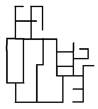
I was impressed by how badly designed the layout of the space was. I began wondering what kind of shit legacy layout had been there before that they had created the new layout on top of. Maybe they suddenly got requirements for more cages so they inserted them wherever they could? Maybe they repurposed rooms into storage space, and just ripped out the door?
Whatever the reason, it was bad. At some point, I even considered bringing a compass. I thought to myself, you couln't make it this confusing even if you intended to. (Hint: foreshadowing.)
The Design Lesson
To not make myself go crazy down there, I invented a game, and it goes like this: every time you're lost, try to figure out why you took a wrong turn.
Here are some reasons I've gotten lost in that space:
- There are doors that look like exits everywhere. The walls are filled with doors to various places, none of which are the exit. Well, one of them is, of course, but it is indistinguishable from the rest.
- The exit is not in the centre of the space. It's on one of the edges. I imagine the centre would have been easier because then you can sort of triangulate it from the corners.
- There are just so many damn intersections. There are long corridors of cages, but they are interspersed with clusters of intersections, most of which lead back into each other.
- There are no landmarks and no indications of direction anywhere. Every intersection looks like all of the others.
- The lengths of the straight sections are slightly and subtly varied, so that when you expect to have ended up back where you started, you're actually somewhere slightly different.
- It's not a clean grid system. There are these "kinks" (like right-angled S bends) in the corridors that throw off your sense of direction by leading you in another direction for a short while before resuming to go in the original direction.
- There are even stripes of glow-in-the-dark material on the floor that are sometimes used to indicate the way to the emergency exits. In this place, those lead to literal dead ends.
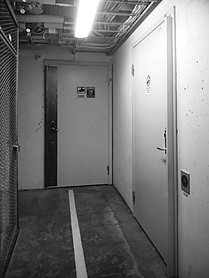
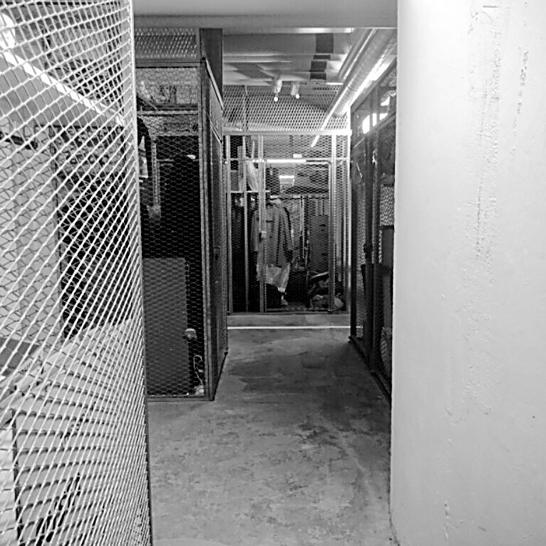
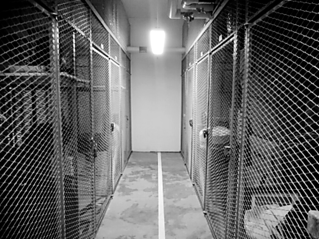
These observations can be viewed as a lesson in how to design a place that does not get people lost. If you do the opposite of these, you're onto something pretty good already!
This little game of "figure out the design flaw" made going down there much more tolerable. I would kind of enjoy getting lost because it also meant I got to figure out why I got lost. It teaches me a little about myself, a decent amount on human psychology, and a lot about how to design spaces humans are supposed to effortlessly traverse. (I'm deliberately vague when I say "spaces"; the same lessons can be applied to GUI design and web page layout.)
Smoking Gun
These days though, I love getting lost down there. I can't get enough of it. That is, after I discovered this sign.
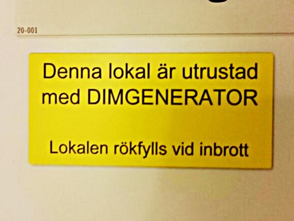
The yellow sign reads,
This building is equipped with a SMOKE GENERATOR. If a break-in is detected, the area will be filled with smoke.
The storage space is designed to get you lost. Once the place is flooded with smoke, it will be nearly impossible to find your way out. Even if you've been there a couple of times before. If I have trouble finding my way out with full vision, I can only imagine how hard it will be when you're panicking and can't see your own hands.
It's not "like a maze down there". It is literally a maze down there.