A noob learns FFT

I have never done any time–frequency transformations. I understand the general idea, but I have never worked with the details. Today I had a reason to use it, but that means learning the basics first.
Pure sine wave
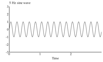
The following is three seconds of a single 5 Hz sine wave, recorded at a sample rate of 100 Hz.1 Well, it’s synthetically generated, but that’s what it represents.
If we run this through the fft function in R, we get a bunch of complex
numbers – as many as we have samples. In this case, that’s 300 of them. The
values of these numbers depend on the amplitude of the signal, so for this
signal, they should max out at 1. However, coming out of the R fft function,
these values are also scaled up by the number of samples. In the following plot,
I have divided by the number of samples to get the amplitudes back out.
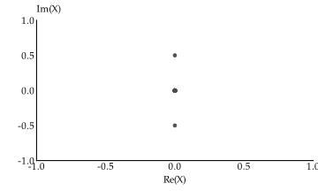
Each point corresponds to the signal amplitude at a specific frequency. Of the 300 points in that plot, 298 of them sit at the origin, because there is no signal with their frequency in the data.
The two points that do exist away from the origin makes it seem like our data had two frequencies, but we only had one! I have to admit this is a quirk of the Fourier transform I don’t fully understand, but apparently the transformation looks at our 5 Hz signal with amplitude 1 and sees two signals:
- One 5 Hz signal with amplitude 0.5, and
- One −5 Hz signal with amplitude −0.5.
These add up to a single 5 Hz signal of amplitude 1. Or something.
Anyway, in this latest plot, the X axis (the real part of the numbers that come
out of fft) correspond to the cosine signal at that point, whereas the Y axis
(the imaginary part) correspond to the sine signal at that point. Since we only
had a sine wave, the real part is zero for all frequencies.
However, that is a bit of a misleading way to look at it. The reason each frequency output is a complex number is because a sine plus a cosine lets us represent a wave of any phase. So it’s more intuitive to look at these complex numbers through their magnitude and angle. The angle is the least interesting. We’ll start with that.
As we have said, the output of fft is a vector of the same length as the
original data. Each value in this vector corresponds to a frequency, with the
first value being “frequency zero”, or the mean of the data. The values after
that correspond to frequencies that are linearly spaced out so that the last
frequency is just below the sampling rate. In the following plot, I have
transformed the X axis from vector indices to frequencies accordingly. The
highest frequency in the plot is nearly the sampling rate of 100 per second.
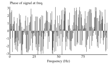
The phase goes from \(-\pi\) to \(\pi\), and in our case it is all over the place.
But that’s not surprising! We don’t have any signal at most of these
frequencies, so we don’t care what the phase is there. What we care about is the
amplitude of the signal at each frequency, and that has the shape we expect.
Here we plot the magnitude of the complex numbers in the fft output, rather
than their angle.
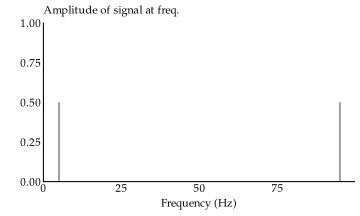
These two bars correspond to 5 Hz and −5 Hz. We can simplify this plot by adding up the mirrored amplitudes and only plotting the first half of the spectrum. After all, Nyquist suggests we cannot recover signals with a frequency higher than half the sample rate.
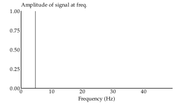
There we go! We recovered the full amplitude of the 5 Hz pure sine wave signal we had. Already there were a lot more details to account for than I knew.
Truncated signal
In the above case, we presented an unnaturally clean signal. The data was even constructed so the sample window captured a whole number of cycles. If we cut the sample off prematurely, we get spectral leakage.
Here are the raw complex values from the fft of the same signal, except we stopped recording at 2.9 seconds, instead of 3 seconds.
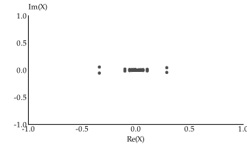
This looks nothing like the previous result. It’s a bit easier to see what happened when we look at the amplitudes at various frequencies.
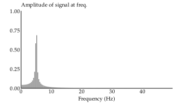
Truncation causes spectral leakage that smears out the clean 5 Hz sine wave into a group of closely related signals. Practically speaking, it’s no big deal: we can still perfectly reconstruct the original signal. The leakage only makes the spectrum look confusing, it doesn’t actually destroy any data.
A common way to deal with truncation is to apply an envelope function to the data that smoothly transitions it to zero near the endpoints. The below plots show the exact same signal as before, except attenuated toward the ends.
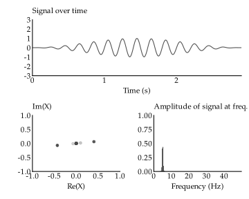
This envelope adds some fuzziness to the spectrum, but it does effectively get rid of the spectral leakage.
A noisy, composite signal
If we add a little noise to the signal, the fft still gets a representative spectrum out of it.
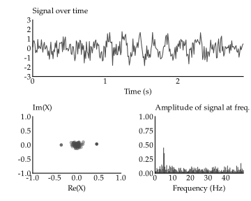
We can see the peak around 5 Hz, but with a noise floor at all other frequencies. In the next group of plots, I have added another sine wave to the signal. It’s hard to tell with this level of noise, but thanks to the magic of the Fourier transform, I’m sure you can pick the frequency out.
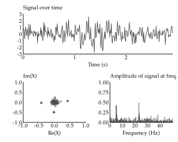
Yep, the 5 Hz wave is still there, and now we also have a 23 Hz wave.
Odd signals
Here are some odd signal types that we might want to know what they look like in the frequency domain. First up, an impulse.
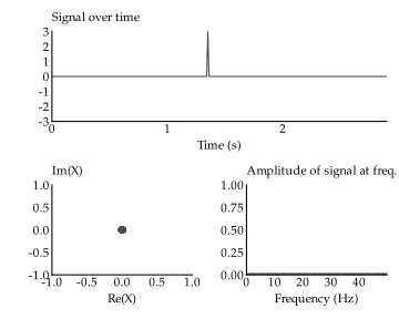
Although it’s not really visible here, the impulse has raised the floor of the spectrum – it contributes to all frequencies.
By contrast, a step function contributes in a decaying manner to low frequencies.
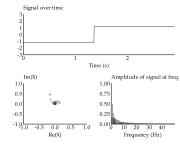
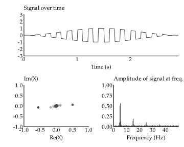
A square wave contributes with decaying odd harmonics.
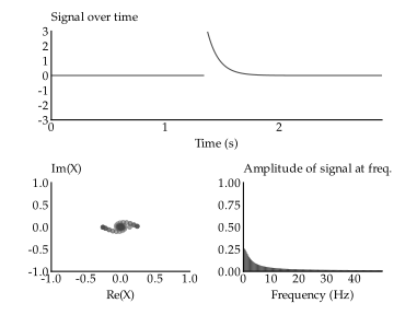
An autoregressive/decaying impulse looks similar to the step function, but smoother.
But enough playing around. There’s some real data I’m interested in.
Computing real growth
I can’t say what this data really means, but fortunately I have a corny cover story ready: outside my children’s bedroom, they’re constructing a building. We’ll pretend I have a measuring device that records the increase in building height every hour, and it’s been doing that for a year.
Because the construction workers primarily work during the day, and on weekdays, I expect daily cycles (building growth from day to day), and weekly cycles (lulls in growth during weekends). In the plot below, the frequency spectrum has been changed to a period spectrum. Thus, a peak at 7 in the spectrum corresponds to a weekly cycle, rather than a frequency of 7 per day.
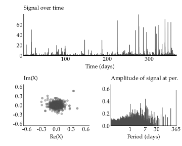
The tallest bar in the spectrum corresponds to a cycle with a period of 365 days. Obviously, given just one year of data, we cannot know whether this is a repeating cycle or not; the bar really only represents a general increase toward the end of the year, and that’s probably true: it seems that building growth has increased.
Aside from the one-day and seven-day cycles we expected, there is also a prominent cycle with a period of 3.5 days. This shows up because the weekday pattern is really a square wave with a duty cycle of 5-on, 2-off. The harmonics we expect to be prominent for that square wave are cycles of length 3.5 days, 2.4 days, 1.4 days, and 1.2 days. There are peaks corresponding to all of those cycles in the spectrum!
Although it’s not visible on this small plot, the spectrum also contains a cycle with a period of two hours. It would be interesting to see if there’s an hourly cycle, but the Nyquist limit says the shortest cycle we can extract from hourly data is one with a period of two hours.
But if we look up from the spectrum onto the time series, we see some sharp peaks in the data. Those are not, generally, real growth. To roll with our corny example, we can pretend that these are artifacts of someone bumping into the table which holds the measuring device, causing a false signal. I want to see what the real growth is over the year, so I need to somehow subtract the bumps from the signal.
Thinking back to our earlier experimentation, we may realise that the bumps are impulses! Maybe we can assume they contribute equally to all frequencies. Then we ought to be able to subtract a constant magnitude from all frequencies and get rid of the worst of the table bumps. I didn’t expect it to work, but it kind of does.
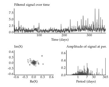
Looking at the filtered time series at the top, the weekly cycles become so much more apparent after filtering out the worst of the false signals. It seems increasingly like there’s one specific day of the week where they do most of the actual construction of the building.2 I notice that my cover story is starting to break apart. Please suspend your disbelief.
We can tell from the period spectrum that the filtering operation had the practical effect of attenuating much of the high-frequency noise, i.e. that with periods shorter than one day. The result is somewhat similar to a rolling median, but the fft based approach retains the day-to-day variation better. For the rolling median have sufficient bump-filtering strength, it must have a window size that is also large enough that it also smooths out much of the daily cycle.
If we think of the peaks as a high-frequency component instead of as separate impulses, we would instead attempt to filter them out with a low-pass filter. This would also zero out the short-period components of the spectrum, but it wouldn’t have any effect on the long-period components. I tried this also, but it didn’t work as well.
I suspct the reason we can’t think of the peaks as high-frequency components is that they are somewhat randomly dispersed. They don’t make up one unified high-frequency signal. Maybe if we made a spectrum for a zoomed-in part of the time series, we could think of them as high-frequency components. Let’s formalise that idea a bit.
Making a spectrogram
In the above analysis we produced a single spectrum for the full year of hourly growth. We could imagine cutting the year up into smaller chunks and computing the spectrum for each chunk. The benefit of this is that if the spectrum changes over the year, we’d get custom spectrums for each chunk, rather than one that’s too general to do anything with.
It’s not obvious what size chunks we should select. Smaller chunks allow us to react to smaller changes in the spectrum, but on the other hand, the length of the chunk sets a limit on the length of the cycle we can detect. Here are some alternatives:
- We can reject daily chunks right away, because there is practically only noise in the signal moving faster than daily cycles.
- We could try weekly chunks, since that would allow us to spot both the daily cycles and weekly cycles. However, having tried weekly chunks, in practice the fft gets too little data per chunk to actually extract any meaningful cycles at all.
- Biweekly chunks had similar problems as weekly chunks.
- Monthly chunks are a bit noisy, but work okay.
- Quarterly chunks also work, but the first three quarters are wholly uninteresting.
What we get out of this is called a spectrogram. The below uses monthly chunks, but regardless of chunk size, the nice thing about plotting the spectrogram under the time series is that we can immediately spot the relationship.
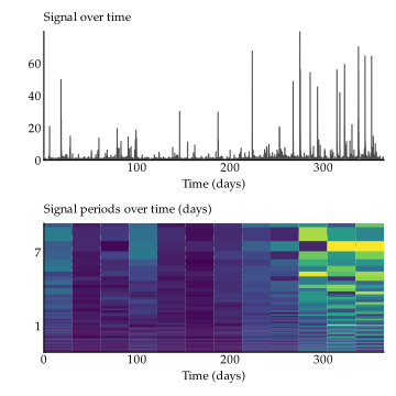
The columns of the spectrogram that are darker correspond to regions of the time series with less activity. The bright columns have more activity. That much is immediately clear!
Then looking more carefully, the weekly cycle is actually not visible during the first 200 or so days of the year. The daily cycle is faint, but visible in almost all months. In the third-to-last month, the weekly cycle seems to be replaced with a biweekly cycle! The overtones of the weekly cycle are really prominent in the last two months.
The drawback of making the spectrogram like this is that if useful information straddles a monthly boundary, the spectrum for either of the months may not catch it. We can address this by sliding a window across the time series instead. The plot below is still made with a monthly window, except instead of jumping from one month to the next, it slides 12 hours over at a time.
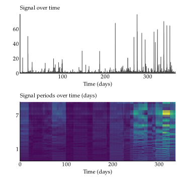
I’m not yet sure I understand all the patterns that come up, but it’s fun to look at and think about!
But now, maybe now we can think of the peaks as high-frequency components? We’d take the spectrum for each window, toss it through a low-pass filter, and then reconstruct the original time series from those consecutive spectra. Thrilling stuff! But that sounds a bit tedious to write the code for, I’ve already spent too long on this article, and there’s another idea I want to explore first.
This marks the end of my fft experiments for now. I’ve definitely become a lot more comfortable with it, and now consider it a tool in my toolkit I didn’t have before. Thanks for tagging along for the ride!