The geometric model of maintenance

On the go? Listen to an ai-narrated version of this article.
Confused? More about ai narration.
James Shore posits that each person-month spent writing code results in 10 days of maintenance in the first year, then 5 days every year after that. Naïvely interpreted, this is a threshold-based model for induced maintenance, and its interesting because it’s so simple.
If it could be shown to be true, that’d be useful. The argument Shore is making about the effects of robot-generated code does not depend on the specific numbers, so Shore’s numbers come from a hypothetical wisdom-of-the-crowds aggregation rather than concrete data. But no hypotheticals are necessary here. We have a thing called git.
Testing the threshold model of maintenance
Let’s say we have a way of labeling each commit as either “new development” or “maintenance”. Then we can count how many commits of each type there are in a month.1 This article will assume that necessary maintenance gets performed, and if maintenance is not performed, that’s because it wasn’t strictly necessary from the aggregate users’ points of view. I know a lot of people would object to that assumption because maintenance they think of as necessary is not performed, but try to suspend your disbelief. If you keep using the software even when that thing is not getting fixed, how necessary is that thing really to keep you around as a user? Possibly better, we can count how much complexity has been handled in a month.2 In this analysis, I am counting the gross commit size, i.e. additions plus deletions, as the amount of effort that went into the commit. One can argue that this is a bad measurement of effort, but it’s the best I have, and in my experience, on longer timescales like the ones we look at here, it’s not so bad.
The following plot shows the cumulative effort that has gone into the development of tmux since its beginning to the day I start writing this article.
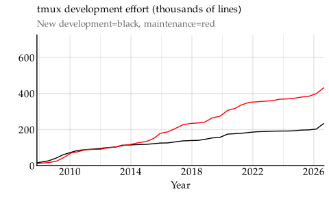
We will look first at the black curve, which represents effort spent adding features to tmux. From left to right:
- In the first month of the repository, a few thousand lines of feature work are present almost from the start.
- From the start in 2008 to 2010, tmux saw rather intense activity at around 30,000 lines of new development effort per year.
- Then new development slowed down, and between 2010 and 2026, it happened at a fairly steady pace of 8,000 lines of effort per year.
- As of today, tmux stands at just over 230,000 lines of effort of new development that have happened throughout its history.
To see how much effort has been spent on maintenance, we perform the same exercise but with the red curve instead.
- Maintenance started dipping behind new development early on, but then traced fairly closely to new development between 2008 and 2014.
- After that, maintenance took off at a rate of 30,000 lines of effort per year, continuing at that pace until 2022.
- Then it slowed down again to around 10,000 lines of effort per year.
- As of today, tmux has required around 430,000 lines of effort for maintenance.
In other words, of the total roughly 660,000 lines of effort spent on tmux, only about a third has been on new development. This has changed over time, and we can find roughly four regimes in the project’s history.
- 2008–2010: Total effort is 60,000 lines per year. About 50 % of that is maintenance.
- 2010–2014: Total effort is 16,000 lines per year. About 50 % of that is maintenance.
- 2014–2022: Total effort is 38,000 lines per year. About 80 % of that is maintenance.
- 2022–2026: Total effort is 18,000 lines per year. About 55 % of that is maintenance.
This is not quite the continuous increase of maintenance fraction predicted by the threshold model. To be sure, we should also check visually. The prediction of the threshold model is represented by the dotted red line.3 Note that we are not using the threshold model to predict the fraction of maintenance here, but instead applying it primitively for what it says about the absolute size of the maintenance demand. In Shore’s original application, he was able to predict the fraction of maintenance through the threshold model, because the model was allowed to also determine the rate of new development (through a fixed monthly work rate.). We don’t do that, because we have the real new development rate of the tmux project. It wouldn’t make sense to impose on the data an assumed new development rate that we already know isn’t true.
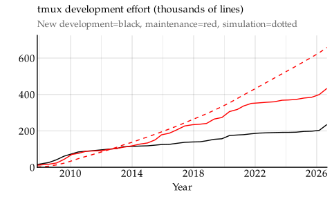
All the way from 2008 to 2022, the simple threshold model does actually fairly closely predict the amount of maintenance tmux has required. But the exponential nature of the threshold model means its prediction eventually goes up faster than actual maintenance performed.4 If new development had been reduced to make room for the maintenance work, as Shore argues is the case for many corporate projects, then maintenance would have leveled off as new development grinds to a halt. But clearly, in the tmux case, new development does not reduce that much to make room for maintenance work. And the same is true for all projects I surveyed, including corporate-backed ones whose primary contributers are on a payroll. This means the model fit will likely worsen as time goes on.
The threshold model is also not a great fit for some other projects, where it generally overestimates the amount of maintenance performed. As one example, maintenance work has made up 63 % of the effort spent on nginx to date, but the threshold model suggests it should be 81 %. Other projects where the model overestimates the maintenance requirements are Rust, VSCode, and Go.
In contrast, the model underestimates the amount of maintenance required for Neovim. The Neovim project has been maintenance-heavy from the start, and through its history, 83 % of the work on Neovim has been maintenance, but the threshold model suggests it should be 70 %.
However, the more general problem with the threshold model is one of timing. This is best illustrated with Syncthing.
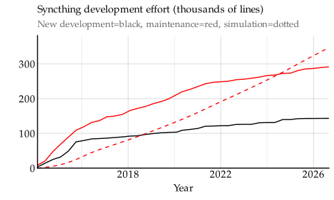
The threshold model lands close to the correct lifetime maintenance fraction here (70 % vs. the real 67 %) but it is nowhere near following the actual maintenance curve.
An apologist could argue that the lack of curve-following is not because the model is wrong, but because the Syncthing project is an outlier that decided to front-load a bunch of maintenance. Unfortunately, Syncthing isn’t the only project where this happens, and it’s actually a symptom of the big flaw of the threshold model. Given a constant level of new feature development, it predicts maintenance will grow exponentially.5 Shore would argue that we cannot base our judgment on a constant level of new feature development because new features should slow down as maintenance takes over the total work effort. But in the projects I’ve looked at, new development seems to happen at a relatively constant level. That doesn’t seem to be what happens in practise in the projects I’ve looked at.
A geometric model
But maybe we can rescue the model by refining it. The original threshold model says that the 100 lines of effort I spend on new development today contributes at least 5 lines of maintenance effort per year until infinity. That’s probably not true, in part because old code tends to be more stable, but also because code is gradually rewritten, so the 100 lines I made today might not even be around five years from now.
We can tweak the threshold model to account for this, by adopting a geometric decay on the maintenance induced by new development. If we pick numbers consistent with what Shore proposed, we’d say that maintenance starts at 5 % of the work performed6 The reason the geometric model starts at 5 % rather than the 0.8/21.7=3.8 % the threshold model has is because the decay starts happening immediately, and proceeds monthly through the first year. Thus, the total maintenance the first year will still be 10 days in this geometric model. (Or nearly so, 11 days is what you get with these rounded numbers.), and decays with 3.6 % per month.7 That means after one year, the maintenance required for 100 lines of work is shrunk to 3 lines of effort per month. After five years, it’s down to half a line of effort per month. After ten years, it’s barely noticeable, at a twentieth of a line per month. However, these numbers would yield results very similar to what we’ve already seen: the maintenance curve doesn’t track actual maintenance performed.
However, we can pick other numbers. For example, if maintenance starts at 4 % of the work performed, and decays with 2.6 % per month, we get a maintenance curve that tracks fairly closely to the new development curve. This happens to work well for nginx, which is light on maintenance:
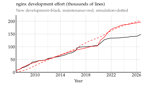
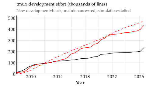
For a project that needs more maintenance, like tmux, the same numbers don’t work. They produce a curve that underestimates the maintenance required.
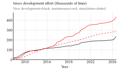
We can ask our computer to pick out the numbers that produce the optimally-fitting modified geometric curve for tmux. This happens at the same 4 % initial value, but decaying with 1.4 % instead of 2.6 %. Here it is, graphically:
If we continue to do this for all projects we have data for, we get a set of numbers with large variation.
| Project | Up-front maintenance | Decay |
|---|---|---|
| nginx | 4 % | 2.6 % |
| tmux | 4 % | 1.4 % |
| Neovim | 20 % | 3.8 % |
| Syncthing | 29 % | 14 % |
| React Native | 7 % | 3.2 % |
| Go | 3 % | 0.7 % |
| VSCode | 48 % | 19 % |
| Rust | 12 % | 3.6 % |
These numbers are not intended to tell us anything causal about how maintenance comes to be. Rather, they’re the just-so numbers we are forced to pick to make the geometric curve follow the actual maintenance performed closely, for each project.
We can take these numbers and extend the maintenance curve ten years into the future, and predict how much maintenance will be needed in these projects even if they completely stop all new development. Here’s nginx.
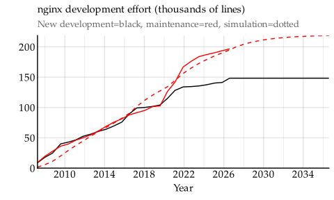
The curve illustrates that nginx is already fairly close to their current maintenance saturation point, and rather little maintenance remains if they freeze all new development now. We can contrast this with something like tmux, which, when extended a decade forward, has a long way to go until their maintenance curve plateaus.
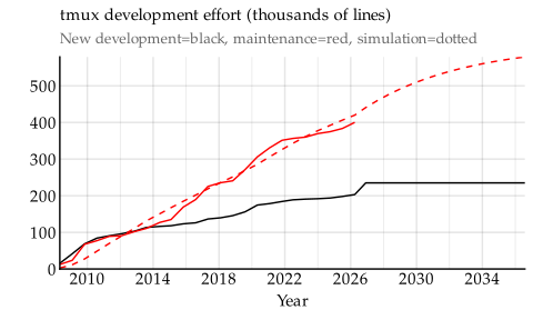
Although it’s neat to be able to reproduce maintenance curves for projects, we shouldn’t really project these curves into the future because that gives viewers the idea that the curves are predictive, when in reality they should be thought of as descriptive. But! These plots indicate that maybe there’s a more human-friendly way to present the numbers, that say something more intuitive about the projects.
The geometric model to characterise projects
Here’s one way to interpret the numbers of the geometric model. With a geometrically decaying series, the sum of all numbers is computed by dividing the starting value by the decay factor. The sum, in this case, represents the total amount of maintenance performed relative to the new development effort.
| Project | Total maintenance |
|---|---|
| nginx | 1.5× |
| Syncthing | 2.0× |
| React Native | 2.1× |
| VSCode | 2.5× |
| tmux | 2.6× |
| Rust | 3.2× |
| Go | 4.3× |
| Neovim | 5.3× |
This is so interesting. According to the geometric model, each hour of new development on nginx produces 1.5 more hours of maintenance work over the lifetime of the project. That is the lowest figure of these projects. It could mean that
- The nginx developers only accept high-quality code, since it needs so little maintenance going forward, or
- nginx runs in fairly predictable environments where few assumptions can be incorrect, and thus few assumptions need to be revised.
The opposite on this spectrum might be something like Neovim, where each hour of new development produces over five hours of maintenance over the lifetime of the project. Neovim likely needs to adapt to a varied set of environments and workflows, where all sorts of edge cases show up.
Isn’t this such a useful rule of thumb already? Now the developers of e.g. tmux know that for every hour of new development they plan, they’ll have to budget around 2.6 hours of maintenance. You can do this for your own projects! Even if you haven’t fitted the curve to your project’s history (or you don’t have a project history to fit to), it seems that 3 hours is somewhere in the middle of the range, so you can assume three hours of maintenance per hour of new development.
But when should you plan to do that maintenance? That’s another thing we can query of the geometric model.
| Project | Elimination time |
|---|---|
| Syncthing | 2 years |
| VSCode | 2 years |
| nginx | 4 years |
| React Native | 5 years |
| Rust | 6 years |
| Neovim | 7 years |
| tmux | 8 years |
| Go | 13 years |
The amount of maintenance needed from new development shrinks over time, as bugs in the code are ironed out. The elimination time in this table is the amount of time it takes until a hundred lines of new development effort need less than one line of maintenance work per month.
We can tell that some projects get through their maintenance fairly quickly (Syncthing, VSCode), but for others it takes longer to find the bugs and sort them out (tmux, Go). The average is six years.
This completes the planning guideline: if we start up a new project, for each hour of new development we plan, we should budget for three hours of maintenance spread out over six years, geometrically decaying. Here’s a handy table.
| New development planned: | 1 day | 1 week | 1 month |
|---|---|---|---|
| Maintenance same year | 10 hours | 6 days | 26 days |
| " year 2 | 7 hours | 4 days | 18 days |
| " year 3 | 5 hours | 3 days | 13 days |
| " year 4 | 3 hours | 2 days | 9 days |
| " year 5 | 2 hours | 1 day | 6 days |
| " year 6 | 2 hours | 1 day | 4 days |
I’m actually surprised that in this average case, just the maintenance induced in the same year as the original new development exceeds the new development time. Thus a one-week project is not a one-week project, it’s a two-week project even when it includes only maintenance performed in the same year. (It’s a four-week project when considering all maintenance borne out of it.)
Further development
While yes, I believe that table is better than nothing – and possibly better than what many are doing today – the geometric model is not realistic. For example, it says that one day of new development has the same elimination time as a month of new development. It also does not account for the size of the existing code; I would think adding more features to an already-big code base should produce more maintenance than adding features to a small code base.
Another thing that bugs me about the geometric model is that the amount of total maintenance produced by a unit of new development varies greatly across projects, as does the elimination time. In order to use the geometric model for planning, we should really fit those values for each project specifically, rather than use these rough averages. These averages happen to work great for projects like Rust, VSCode. They are pessimistic for projects like Go, Syncthing, tmux, and nginx. And they still underestimate the maintenance required for a project like Neovim.
I don’t think we’ll ever get a model of induced maintenance that is completely free of estimation – some projects simply need more maintenance than others – but perhaps we can get an slightly better fit? Perhaps we can find a model where some parameters are stable across projects and don’t need re-estimation? That would tell us something deeper about how software development works.
I have some ideas for how to go about this, but that’ll be another day.
Acknowledgements
I am grateful to James Shore for reviewing a draft of this article. He had very insightful suggestions for improvements. In particular, some of the detailed sidenotes clarifying the methodology are entirely to his credit. As always, mistakes are my own.
He also noted that my presentation of his application of the threshold model was based on a flawed reading of the spreadsheet. To clarify, I must emphasise that the primitive application of the model we use here – where all new development adds an absolute level of maintenance – is not the model Shore presented, nor the way he used it in his article.
The way Shore uses the model, he lets past new development drive both maintenance and hypothetical new development, and we cannot do that, because we already have the actual new development that happened. I would argue the application in this article makes for a better test of general fit and validity, but it says very little about the way Shore applies the model, which is in completely different circumstances.
I strongly recommend reading his article series, and digging into the details of the spreadsheet, if you’re curious about that.