Python Programmers’ Experience
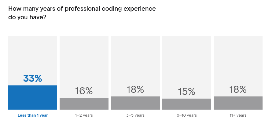
The Python Developers Survey 2023 has an interesting result that is incorrectly reported.
By incorrectly, I mean the raw data is there, but there is no attempt at presenting it in a meaningful way. I’m talking about the professional experience level of Python programmers.

The buckets here are unequal in size, meaning the correct way to present this data would be as a bar chart where the area of each bar corresponds to the number of respondents that fell into that bucket.1 That’s actually always the correct way to make bar charts. It’s just that when the buckets are equal in width, their area is entirely determined by their height.
Of course, it’s a problem that we don’t know the size of the last bucket, but for the sake of argument we’ll pretend it spans 11–25 years.2 Chosing 25 as the longest professional experience someone could have had because Python 2 is about 25 years old. Although Python 1.0 was released 30 years ago, these things take some time to catch on. Plus at the time computers were not very fast and Python would have been a hard sell for production code. When designing surveys, it is valuable to aim for closed buckets to avoid this problem.
Here’s what the same plot looks like when rendered correctly:
 33 %
┌───┐
│   │
│   │
│   │
│   │
│   │ 16 %
│   ├───┐
│   │   │
│   │   │    18 %
│   │   ├───────────┐       15 %
│   │   │           ├──────────────────┐         18 %
│   │   │           │                  ├─────────────── ─ ─ ─
  1   2   3   4   5   6   7   8   9  10  11  12  13  14 . . .
When choosing the right form of visualisation, the data speaks for itself.
Since this is an exponential curve, we can fit a line to the logarithm of the heights of the midpoints of the bars. When we do so, we learn that the size of the professional Python workforce grows by, on average, 10–25 % per year, and appears to have done so for “11+ years”.3 It might seem like the most recent year is an outlier, since it contains 1/3 of the workforce. I think a more likely explanation is that a lot of people dabble with Python their first year and then go on to do something else and fall off the curve, so recent years always seem like larger increases than earlier years.
This has fun consequences for hiring, of course. Since a growth rate in that range implies the workforce doubles in size every four years, it means half the applicants to any Python position will have less than four years of experience. Always!
It’s a shame the report results did not highlight this, because it’s such a clear relationship when choosing the right type of visualisation.