Rethinking Text Input on Touch Screens
A note on terminology: I'm going to say "phones" a lot, in reference to modern mobile phones, or "smartphones". However, this article applies to any small computer with a touchscreen as its primary input device. In fact, you could argue that "phone" is a very limiting description for the general-purpose computers we have in our pockets. I'd love if we had a better word for the thing I want to refer to, but we do not, so "phone" it is.
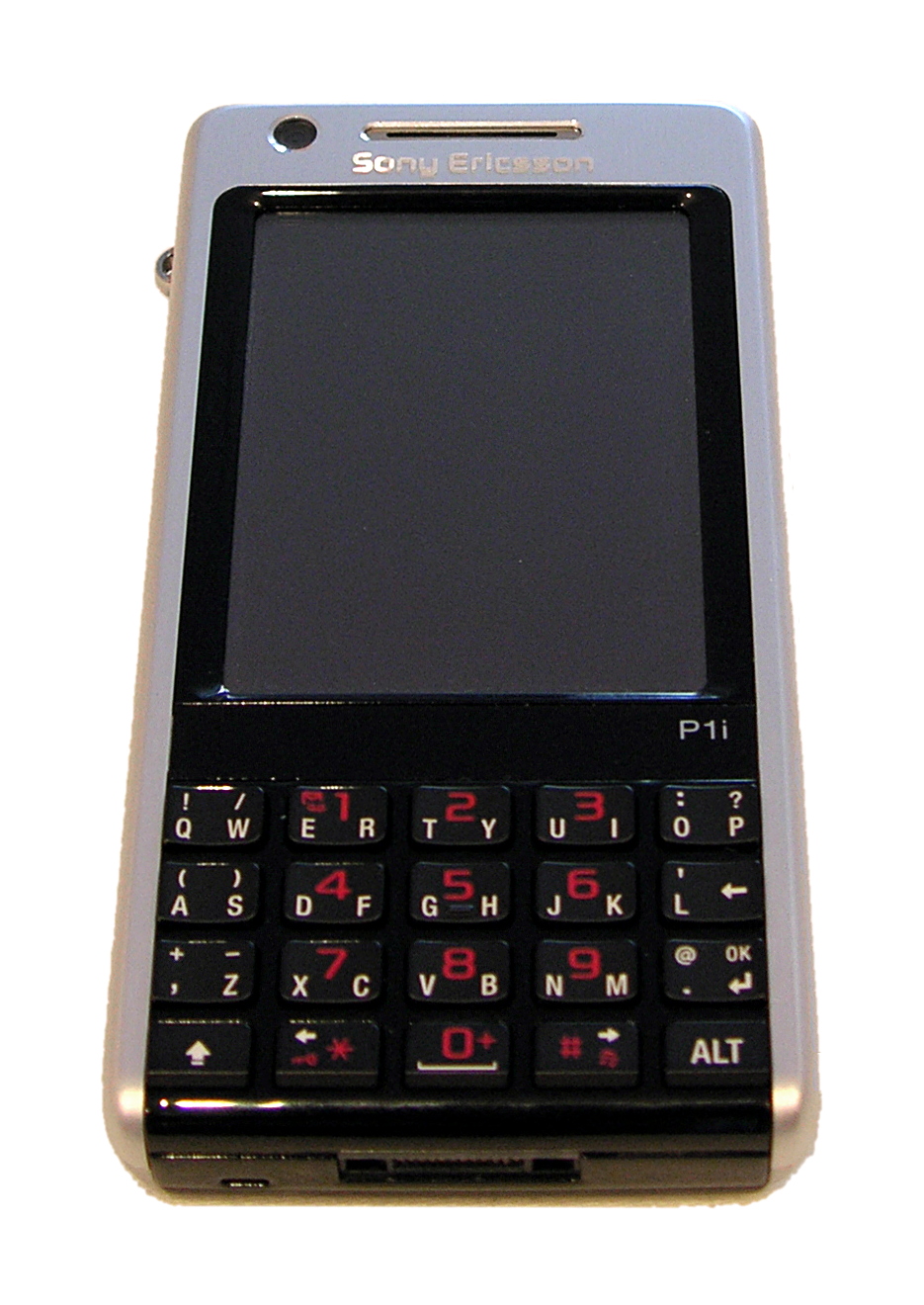
Touchscreens, in particular on the mobile phones of today, have a major interface problem that's mostly gone unaddressed for the last 8 or so years since the first iPhone was released. Mobile phones with touchscreens released before the iPhone used to actually have physical buttons for text input. Those phones were crappy in very many ways compared to the magic miracles that are modern phones (which you may very well be using to read this article), but they certainly made text input easier.
And this isn't one of those QWERTY vs. Dvorak vs. Colemak rants. I could go on about that as well, but this is a much deeper problem. In fact, QWERTY is actually fairly decent for mobile phones, purely in terms of layout. QWERTY is probably better on mobile phones than Colemak, and possibly even better than Dvorak. If you're curious why, there's a paragraph in the next section for you! Otherwise, just read on.
Typewriters and Touchscreens
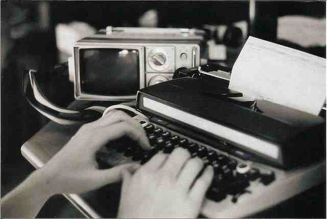
As I said, this problem goes way deeper. Keyboards, as they have appeared on mobile phones, and personal computers before that, come from typewriters, which were designed to be used with ten fingers.
The positioning of the keys, in a horizontally stretched layout, is in part because you're meant to press the leftmost keys with your left pinky, the column past that with your left ring finger, and so on. Each finger has only a few keys to care for, and the keys are sized to be slightly larger than a finger.
This is – by the way – why Colemak and Dvorak aren't that great for mobile phones. They are ultimately optimised for ten-finger input. They are designed with ten fingers as a fundamental assumption. Violate that assumption and you end up with a shitty layout unless you're extremely lucky. Qwerty isn't as optimised for ten-finger typing, so it doesn't suffer as much when you remove the ten finger assumption.
So what happens when you take one of these horizontal keyboards and squeeeeze it down to fit on a small touchscreen? Well... people stop typing with all their ten fingers, for one. There just isn't room for ten fingers. The keys also get significantly smaller than the fingers, requiring more precision. Even if you have slender, dexterous fingers and feel like the precision is not a problem, you no longer get the mechanical feedback of a physical keyboard. You just don't know which key you hit unless you're looking straight at it – but then you're not seeing oncoming cars as a pedestrian, or what someone else is simultaneously writing to you as a chatroom participant.
Of course, people have been thinking about this problem, and some solutions exist. The problem is that most solutions use some sort of text prediction system. Don't get me wrong, text prediction is a seriously cool subfield of artificial intelligence, and I'm impressed with the results. We're just not quite there yet. Not for some languages.
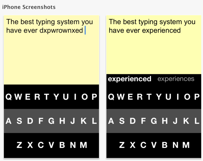
Image from NosillaCast Mac Podcast.
In my native tongue, Swedish, it is perfectly grammatically valid to construct new words by combining existing words. A word like "studiepausekonomi" is actually the combination of three words: "studie-paus-ekonomi", literally translated as "education-pause-finances" and is most reasonably interpreted as the financial status of a person who has taken a pause in their education. Text prediction systems just cannot deal with this. They tend to have the most common cases hard-coded as words, but they lack the intelligence to understand in which ways you are allowed to combine words to form new ones.
In a language where such combinations are relatively common, text prediction systems, however cool, just won't cut it.
So in conclusion, we have a two hundred year old typewriter technology which we mindlessly crammed into our new devices, we discovered it didn't work, so we tried to patch things over by taking some control from the user and putting it into AI software.
Did anyone think that would be a smashing hit?
I'm being a bit facetious here: of course the decision wasn't mindlessly made. There is a good reason to use QWERTY keyboards even where it leads to technological impairment, and that is the power of habit. People know QWERTY so they are going to like it better than the alternatives even though it's not actually that good.
Beyond Text Prediction
Since text prediction isn't always that great, a universal solution to text input, at least when it comes to alphabet-based writing systems, is character-by-character input. (This may or may not generalise to other kinds of writing systems, like Kanji or Hangul.) In other words, the base assumption should be that the user needs to explicitly ask for every single character that goes into the text. It sounds tedious, but it can be made convenient. Remember that after all, regular physical keyboards are character-by-character.
There are some decent options for this, including GKOS and MessagEase which both try to use either finger motions (swiping) or multi-touch (chording) to increase the number of input dimensions. If, in addition to pressing a virtual key on your screen, you can press the key and then move your finger in one of four directions, you have essentially allowed for five different characters to be entered with just a single virtual key. The same thing goes for chording, where in addition to pressing virtual key K alone, you can press virtual key K and virtual key N simultaneously for a different character, This allows those solutions to cut down on the number of virtual keys, which in turn makes the virtual keys bigger, and therefore harder to miss.
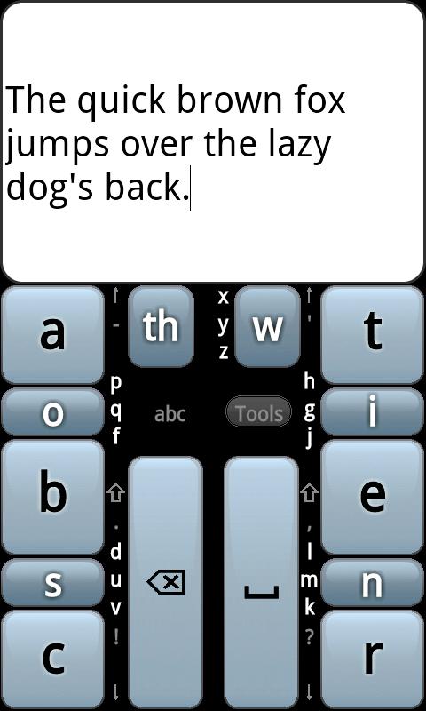
That's good! And the mentioned solutions even use character frequency tables for the languages they support, which puts the most common characters in "easy" positions and rare characters in "harder" positions (imagine pressing three keys simultaneously, or making a more complex swiping motion.)
But come on! Character frequency? There is so much more to text analysis than that. Remember those things called shorthand systems? They are built on meticulous study of languages. Let's use some of that.
Digraphs, Trigraphs and n-graphs
Something that comes naturally on touch screens but do not on physical keyboards is "sliding" between keys, or "swiping". Let's use this to our strength. Consider the following silly example, which is the best I can come up with just before lunch:
Browning singled out an amazing finger filling, and accordingly Bingo cringed. It's appalling!
You get the point. Count the number of "-ing-"s in that paragraph. Hopefully you get nine, or the lack of food is seriously getting to me.
Something like "ing" should be convenient to type on our keyboard. What if we arrange the keys such that the keys for "ing" are adjacent to each other? Like this:
+----+  +----+  +----+
|    |  |    |  |    |
| I  |  | N  |  | G  |
+----+  +----+  +----+
If we let the user swipe from one key to the next, now they could type "ing" with a single stroke. In the silly example, that's a stroke reduction of – wait for it – almost 20%!
This is called n-graph analysis (digraph is special case n=2, trigraph is special case n=3) and concerns the frequency of certain combinations of letters occurring together. It is clearly something we want to use to make input more efficient. There are some other ideas here that I stole from an old web page that I can't find anymore – but now someone on IRC linked it back to me! They are these:
- In case it isn't obvious by now, trash the horizontal shape of the typewriter keyboard. Making the keyboard close to square gives you more area for each virtual key.
- Common letters should probably be located centrally, making them easier to reach for lefties and righties alike.
- If we put the space key in the middle (and make it as small as a regular key – why should this key get to occupy the same space as like five regular keys? It's not that important!) we give the users the capability of not interrupting a stroke at each word boundary – they can go from the end of a word, over the space, onto the beginning of the next word, all in one smooth stroke.
- What about common digraphs that can't be next to each other because all four neighbouring slots are already occupied? This is a problem. Two-thumb typing suggests they should be located on opposite sides of the keyboard, to allow for hand alternation. One-thumb typists want them to still be as close as possible to each other, to minimise finger travel. No clear answer here.
- However, and this is where it gets a bit hardcore, digraphs that commonly end and begin words should definitely be located centrally, around the space key. This is especially useful with something like "de-" which is a common prefix (word beginning) as well as a common suffix (word ending) in the form of "-ed". You see? We can put "d" next to the space key, and "e" outside of that. If the user wants to say "we tried defusing the situation" you'll notice that the central portion of "[tri]ed de[fusing]" can be written as one stroke by just going back and forth. We gained a suffix for free by giving the user a prefix!
- Okay and here's a cool one. Make the keys shaped like hexagons. Put them in a honeycomb-like grid. Why? It increases the number of neighbours they have, allowing the user to slide between keys to create more letter combinations.
KeyBee
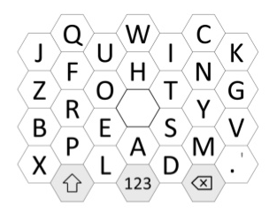
A prototype of this exists in the Google Play Android app store. It's called KeyBee. It doesn't yet support very many languages, because 1) it's not very popular, and 2) it's a one-man spare-time effort. It does however work decently for Swedish using the German layout.
I suggest trying it out for a week or so, which should be enough to learn to use it properly. It needs more people to talk about it because it's actually pretty great.
I know it's not QWERTY-based at all, so it will take a while to learn. That's okay. Familiarity with one interface is not an excuse to try to shoehorn that interface into every interaction of your life. Learning new interfaces is good not only because it teaches you new interfaces, but also because you get better at learning new interfaces – a very useful skill indeed.