Wiggling Into Correlation
Jeff Kaufman shared some data around contra dance attendance as a function of requirements on wearing surgical masks. He compares this data to survey data, which is a useful way to validate in both directions.
I found the plot compelling for a different reason – depending on how we look at it, we can draw wildly different conclusions from it. On the one hand, if we draw boxes around consecutive pairs of dances, it’s fairly obvious that mask-optional dances are more popular. Tickmarks at the top indicate pairs that support the hypothesis.1 Some dances had to be excluded from pairs because there are not equal numbers of both kinds. I decided to mechanically pick “the next pair” whenever there were runs of the same type of dance, which means no bias was introduced by cleverly selecting pairs, even if that particular mechanic may result in more extreme results than some other mechanic.
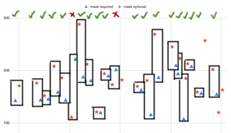
It doesn’t require much statistical literacy to recognise that 18/20 successes is statistically significant.2 For completeness, the Agresti–Coull (“add two successes and two failures”) confidence interval is 68.1–98.5 %, well clear of the null hypothesis of 50 %. I would entertain arguments that this is a sensible procedure, because it’s likely dances close in time share other common factors that affect popularity, so this could be said to give an apples-for-apples comparison.
But we don’t know these pairs are of the all-else-equal kind. They rarely aren’t when the experiment is not intentionally designed to be paired. For example, maybe the first dance of a pair tends to steal participants from the second? We could test this by lagging the pairs by one, such that pairs tend to have the mask-required dance first.
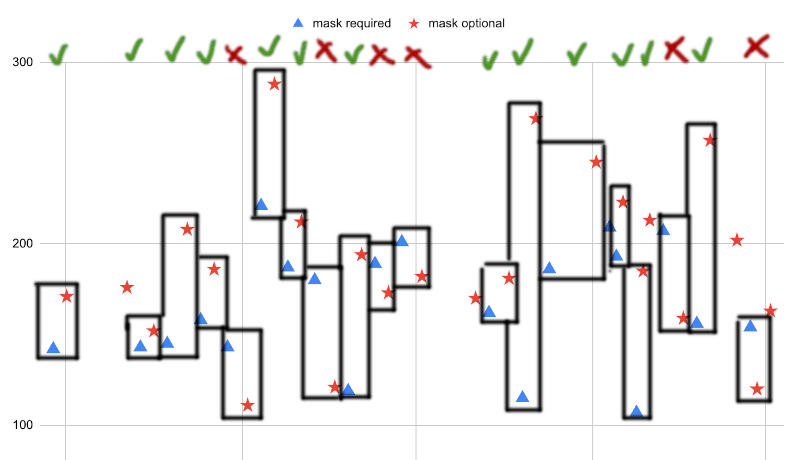
These pairs aren’t as neat, but when we do this, we discover that only 13 out of the 19 new pairs support the hypothesis. That’s much less obviously meaningful.3 By way of confirmation, the Agresti–Coull interval now comfortably straddles the null hypothesis, at 40.6–89.8 %.
Given the lack of pairing in the design, we’ll go back to basics, and compare sources of variation. The number of attendees at the dances wiggles up and down for a multitude of reasons. These reasons (and many more) are called sources of variation in the attendance.
- Maybe some dances are far away from where everyone lives;
- maybe some dances coincide with national holidays;
- maybe some dances are hosted by someone really popular;
- maybe some dances are not marketed well at all;
- maybe some dances offer free food;
- but crucially for our analysis maybe some dances disincentivise attendance by requiring surgical masks.
What we want want to figure out here is “how much of the variation in attendance is due to the mask requirement compared to all other sources?”
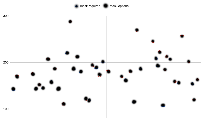
First we need to figure out how much variation in attendance is there in the first place. This we will call the total variation, and to get it we will censor each data point such that we don’t know whether it belongs to a mask-required or mask-optional dance.
In order to estimate the variation on the go, there’s that spc hack to get the total standard deviation of the data. We start by imagining vertical bars between consecutive points in the plot. The height of these bars make up a kind of measure of the internal variation in the data. We estimate the height of these bars by reference to the gridlines, and compute their mean height.
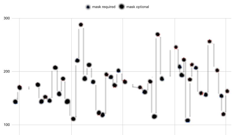
To be clear, we never actually print out the plot and draw bars on it, nor do we ever write down the individual heights of the bars. We simply scan through the plot, eyeball the vertical distance between consecutive points, and continuously sum the distances up. Then we divide by the number of points minus one. On my way to work, I got 41 as the average vertical distance between points. Your number is likely to be different, as this is not an exact procedure.
As detailed in the article on this hack, this process overestimates the standard deviation by 12.8 %, so we’ll scale back and arrive at 36 as the standard deviation. We square this to get the total variance: 1,320.
Then we perform the same operation on just the mask-required dances.
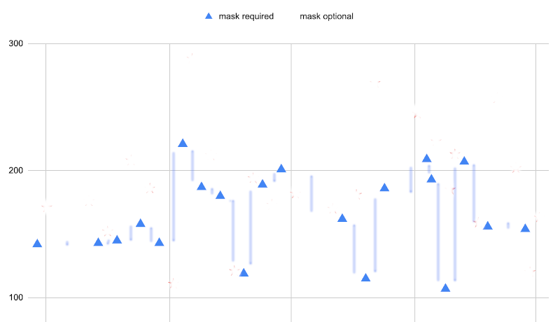
We estimate the average height of the bars to be 34. What’s neat about this level of variation is that it’s independent of the effects of mask requirements, since the mask requirements are the same for all dances here. In other words, this variation must be due to sources other than masking. We’ll do the same thing for the mask-optional dances.
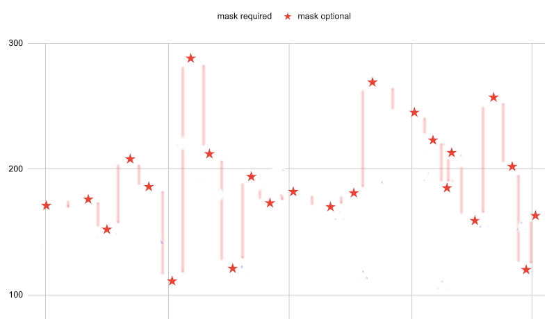
The averge height here is maybe 45. We are going to assume that the same sources of variation affect both mask-required and mask-optional dances, so we’ll take the average of these averages:
\[\frac{19 \times 34 + 23 \times 45}{19 + 23} \approx 40\]
We land at a grand average across both groups of 40. Corrected and squared, this is a variance of 1,260.
As a reminder: the variance we got out of the groups independently, 1,260, must be due to sources other than masking requirements, since the masking requirements are the same for all dances within those groups. This is to be contrasted with the total variation, 1,320, which includes the additional variation source of masking requirements.
Since we have measured variation using the variance, our measurements are additive: the total variance is the sum of all sources of variance. Thus, we can fill out the equation:
total_variance = other_sources + masking_requirements
    1320       =      1260     +        ?
and it’s clear we’re looking at
total_variance = other_sources + masking_requirements
    1320       =      1260     +       60
In other words, other sources account for most of the variation in dance attendance, and masking only plays a small part. The amount of the total variation contributed by masking requirements is 5 %. This number is called the coefficient of determination, and its square root is the correlation: 0.21. This correlation is low enough that we cannot conclude that masking has a significant effect on attendance.4 For details on this, see the surprising richness of correlations.
But look at that! We measured the total variation, and then we measured the variation within the groups to figure out how much variation is caused by sources other than masking, and this let us paint an intuitive picture of how much of an effect masking has. The correlation we got out of this handwavy procedure is even somewhat close to the real number. To make sure, I transcribed the plot into numbers, and R tells me the correlation is actually 0.29.5 Still not statistically significant at traditional levels.
“But it still looks like masking has an effect!!” It does. It’s just that if the effect is there, it is small enough that we cannot statistically prove an effect with just 44 dances. Assuming the coefficient of determination really is 5 %, and we are aiming for a traditional significance level of 0.05, the sample size curves tell us we would need over 80 dances to be sure of the effect of masking.