Intuition for distribution differences

Imagine every person in a country is assigned some sort of score, and a higher score is better. I can’t share the specifics around the score I’m investigating right now1 If you need a concrete measurement to latch on to, pretend it’s about life satisfaction, or maybe years between emergency department visits, or something else along those lines., but on the population level it is collected by a government agency. Here’s the distribution of these scores for the population in my country.
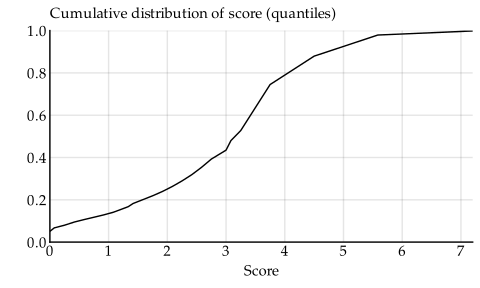
Since the curve does not start at the origin but a few percent up on the y axis, we can conclude that a few percent of the population have a score of zero. That doesn’t mean they are bad or miserable people – there may be factors that make zero the best score for them – but on average, a score of zero is worse than a higher score.
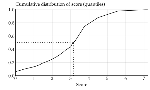
We can also find the median score, a score that is higher than that of half of the population, by finding the point halfway up the y axis. This is the 50 % point, and it’s right in between 0.4 and 0.6 on the y axis. Starting from there, and then tracing a line right toward the distribution curve, and then turning down toward the x axis, we find the median score – the score that corresponds to the middle 50 % of the distribution. The median score is just over three.
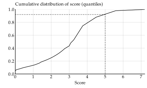
Furthermore, a score of five or higher is achieved by only 10 % of the population, since if we trace a line from five on the x axis up to the curve, and then back to the y axis, it lands around the 90 % mark, meaning 90 % of the population have a score lower than five.
Now comes the question: if we want our children to have a better opportunity to achieve a high score, should we move to the big city? We can compare the score distributions of city-dwellers with the general population.
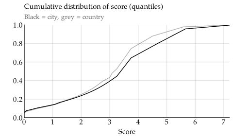
We see that about the same number of people in the city have a score of zero, but then it comes apart toward the higher scores. The scores of city-dwellers are more stretched out toward the high end. The effect is that the distribution curve for city-dwellers consistently sits below that for the general population. This means city-dwellers overall have a higher score. When I look at comparisons like these, I often make the mistake of thinking city people have lower scores, because their curve is lower, but a lower cumulative distribution curve really means higher values. When uncertain, we can perform the line-tracing exercises from before to be sure.
There’s also a treatment we can give our children that may improve their chances of getting a good score. There are no national statistics on the scores of people who have gotten this particular treatment, but I managed to collect scores from a small but randomly selected sample.2 Bless laws that give the public access to official records.
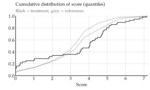
The curve for the treatment sample is first above and then below the reference lines. That means the treatment probably does not improve the score across the board, but neither does it make it worse. Rather, it means the treatment group score has greater variation than the general population.3 If the curve had been first below and then above the reference lines, it would have meant that the treatment group had lower variation than the general population. Most people in the treatment group do indeed get better scores, but the bottom 33 % or so get worse scores. In particular, the treatment appears to double the risk of getting a zero score.
Note how much more nuanced this view is than it would have been if we merely compared the averages of each group.
- The arithmetic means of the reference curves are 3.1 and 3.5, and the mean of the treatment curve is 3.3. This makes it seem like the treatment sits right in between the references, which would hint it makes no difference to the score.
- On the other hand, the medians of the references are 3.3 and 3.8, but the median of the treatment is 4.0. That’s probably not a significant difference, but it’s not as clearly a nothingburger as the arithmetic mean.
If we hadn’t looked at the distributions visually like we did, then these two observations would have seemed contradictory. But from the plot, it’s clear the increased variation explains both of these observations.
The next step would be to check if the differences we see are actually statistically significant. For this I have made a great tool you can use, and I will introduce it in a later article.