Kuiper Q-Q plot: are these the same?

When we tried to get an intuition for the differences in distribution functions, we learned that children subjected to a treatment had greater variation in their score than the reference group.
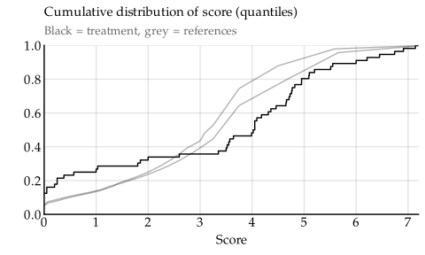
However, we couldn’t tell if this difference was large enough to be a useful guide for making decisions. It could just be an artifact of the small sample size.
Summary
In case you know the drill already, just paste your data into the tool and get on with your life. I wish I had made this long ago! That tool shows a q-q plot for visual comparison, it computes Kuiper’s test statistic, and has a handy reference table for significance thresholds.
It lets you choose between multiple theoretical reference distributions. Or you can input your own reference distribution, either as an empirical distribution function known exactly, or a reference sample with embedded uncertainty. The theoretical reference distributions that support it come with aic values for model selection.
If none of the above made any sense to you, read on.
Tests of distribution similarity
Many quantitative questions in life take the same general shape:
- We have some maybe-special data.
- We know such data commonly follows some distribution.
- We want to know if the maybe-special data belongs to the common case, or if it is indeed special in some way.
We tend to have a good idea of what happens generally – this is a reference distribution we know with certainty (in our example, what the scores are for the population in general). We then have a smaller set of data points – a sample – which we think might be special in some way (in our example, the scores of a treatment group), but we’re not sure. To get more sure, we want to perform some sort of test that can tell us if our sample is actually special. If the test fails, we’ll assume our sample is a small manifestation of the reference distribution.
Such a test would be like a black box with two slots and a light bulb. Into the big slot, we put a reference distribution. In the smaller slot, we slide in our sample. Then the box hums for a brief moment, and when it goes silent, one of two things can happen. Either
- the light bulb lights up! In which case the box has determined, with high certainty, that the sample did not come from the reference distribution1 Okay, this is a frequentist test, so technically what the box has determined is that if repeated, similar-sized draws were made from the reference distribution, the test statistic would be less extreme in more than 95 % of them. But frequentist confidence intervals commonly approach Bayesian posterior credible intervals, so I’m going to gloss over this difference. Albers, Kiers, and Ravenwaaij’s 2018 argument is the commonly cited defense.; or
- the light bulb stays off, in which case the box cannot tell the sample and the reference distribution apart.
It’s important to note that in the second case, the box does not claim the sample came from the reference distribution. That’s impossible to prove, because it may come from something that’s so subtly different it isn’t detectable with limited data. The lamp staying dark only means the sample wasn’t different enough from the reference distribution to tell them apart. This can happen because they are the same, or because they are very-similar-but-not-the-same, but also because the sample is too small to achieve certainty in the difference, even if the difference is quite large.
False positives and false negatives
Thanks to the random nature of … things, such a test will sometimes show the wrong result. It can indicate our sample is special even when it is not (a false positive; a type I error). It may also fail to indicate that our sample is special even when it is (a false negative; a type II error).
Since type I and and type II errors trade off against each other, we cannot set targets for both types of errors to be low. Instead, we set a target for a low type I error (i.e. low false positive rate), and then we look for a test that has as low a false negative as possible within that constraint. The reason we focus on false positives is because we want to be fairly confident before we claim a sample is special, so we prioritise rarity of false positives.
It is very common in science to pick a test that gives a false positive once every 20 uses of the test, but the appropriate choice threshold depends on what decisions are powered by the conclusion. For the sake of argument, let’s say we want a type I error rate of 10 % – once in every ten applications gives a false positive.
Then of the tests with that false positive rate, we are looking for a test with as low type II error rate as possible, or, in statistical terminology, a test with high power. The statistical power of a test is its ability to successfully detect that a sample is special, even if it’s only very little special so it might be hard to see.
There’s a third concern, however. For quick-and-dirty decisions, we want a widely applicable test. This desire is in tension with the desire for a powerful test, because narrower tests are usually more powerful, but require more thought on when they are valid to use. We don’t want to pick up a book on statistics before choosing a test, so we stick with tests that are widely applicable; tests we can use almost no matter where the data comes from, as long as the sample is random. These tests will be less powerful, but that’s a tradeoff we’re willing to make to keep testing simple and easy.
That leaves us with three priorities for the black box that will tell samples from reference distributions:
- A low false positive rate. Aiming for 10 %, but ideally this would be a knob we can tweak. This is most important, because we want to be somewhat confident in our conclusions.
- A widely applicable test. We should need to think as little as possible about what sort of samples and reference distributions we put into the box.
- A test with high power. This stands in opposition to the above two priorities, so we’ll have to settle with less power than ideal, but we’ll still aim for the highest we can within the constraints at hand.
Before we get into the zoo of available tests, we should make a small technical detour.
Test statistics and significance thresholds
It’s useful to understand the basics of how these tests work, so let’s open up the black box only a tiny bit and peer inside. It’s dark in there, so we’ll only get a rough outline of the machinery inside.
As we have said, the test takes the reference distribution and a sample. From these, the test computes a test statistic. The name “test statistic” sounds very formal and specific, but there are literally no rules for how to compute the test statistic. Any maths you can think about that involves the reference distribution and sample is fair game.
The only requirement on the test statistic is that its computed value at the desired confidence level must be known and tabulated somewhere for all possible reference distributions and sample sizes. That’s the magic, difficult bit. It’s easy to come up with various ways of computing test statistics; it’s much harder to prove that they can be translated into a confidence level that is correct for any inputs.
But once we have done the hard work of finding the right computation, the black box can compute the test statistic for the inputs, and then look it up in one of those tables. On the basis of that, the test can indicates whether the sample is special or not.
Candidate tests
For better or worse, there aren’t very many tests that fit our criteria.
- The Kolmogorov–Smirnov test is simple and very popular. The test statistic is computed by taking the greatest difference between the distribution implied by the sample and the reference distribution and scaling it by the number of values in the sample. There are many tables available for comparing this value to the appropriate confidence threshold.
The Cramér–von Mises and Anderson–Darling tests are both popular special cases of a family of tests. In this family, the test statistic is computed from all sample values, rather than only the greatest difference. This makes these tests strictly more powerful than Kolmogorov–Smirnov, but also more complicated to compute.
The Cramér–von Mises statistic weighs all parts of the sample equally, whereas the Anderson–Darling test derives more of the statistic value from the tails of the sample. This makes Anderson–Darling more powerful in many cases, but again, slightly more complicated to compute.
All three of these tests have one drawback: they are not invariant under rotation. This means that if the measurement of interest has a cyclic distribution (e.g. hours of the day, wind direction, hue in colour spaces, edge direction in images, etc.), then these tests can detect spurious differences that aren’t really there, and only appear due to accidents of rotation.2 If something happens a lot around midnight, for example, these tests will see that as it happening “at the start of the day” and separately “at the end of the day” rather than as one lump of events that just happens to straddle a cut-off point. Fortunately, there are tests that are invariant under rotation.
- Kuiper’s test is like the Kolmogorov–Smirnov test except the test statistic is based on the sum of the greatest deviations in both directions from the reference distribution. This makes Kuiper’s test more powerful than Kolmogorov–Smirnov, and somehow it also makes it invariant under rotation.3 This is particularly neat because rotational invariance would typically trade away some power, by virtue of being more general. But in this case we get both rotational invariance and greater power. Kuiper’s test is only a tiny bit more complicated, and otherwise a strict improvement over the Kolmogorov–Smirnov test.
- The Watson U² test is an adjustment to the Cramér–von Mises family of tests that makes them rotationally invariant. This means the Watson U² test is more powerful than Kuiper’s test, but also more complicated to perform.
I think Kuiper’s test really hits a sweet spot between power, appropriateness for cyclic and non-cyclic distributions alike, and simplicity. We’ll use that going forward. My implementation of the test is based on the procedure used in Stephens’ modification4 Use of the Kolmogorov–Smirnov, Cramér–von Mises, and related statistics without extensive tables; Stephens; Journal of the Royal Statistical Society; 1970. of the test, mainly because the paper where it’s introduced happened to be a good, concise reference.
The q-q plot
Recall the plot we were confused by. We had a grey reference distribution, and on top of it we overlaid a sample that had undergone treatment. The treatment sample looks like it comes from a different distribution, but does it?
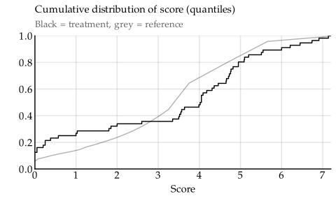
We can imagine stretching, warping, and squeezing this plot so that the grey reference line becomes a straight diagonal line. I took a screenshot of the plot above, opened it in Gimp, stretched out some parts and compressed others, until the grey line almost became a straight diagonal.
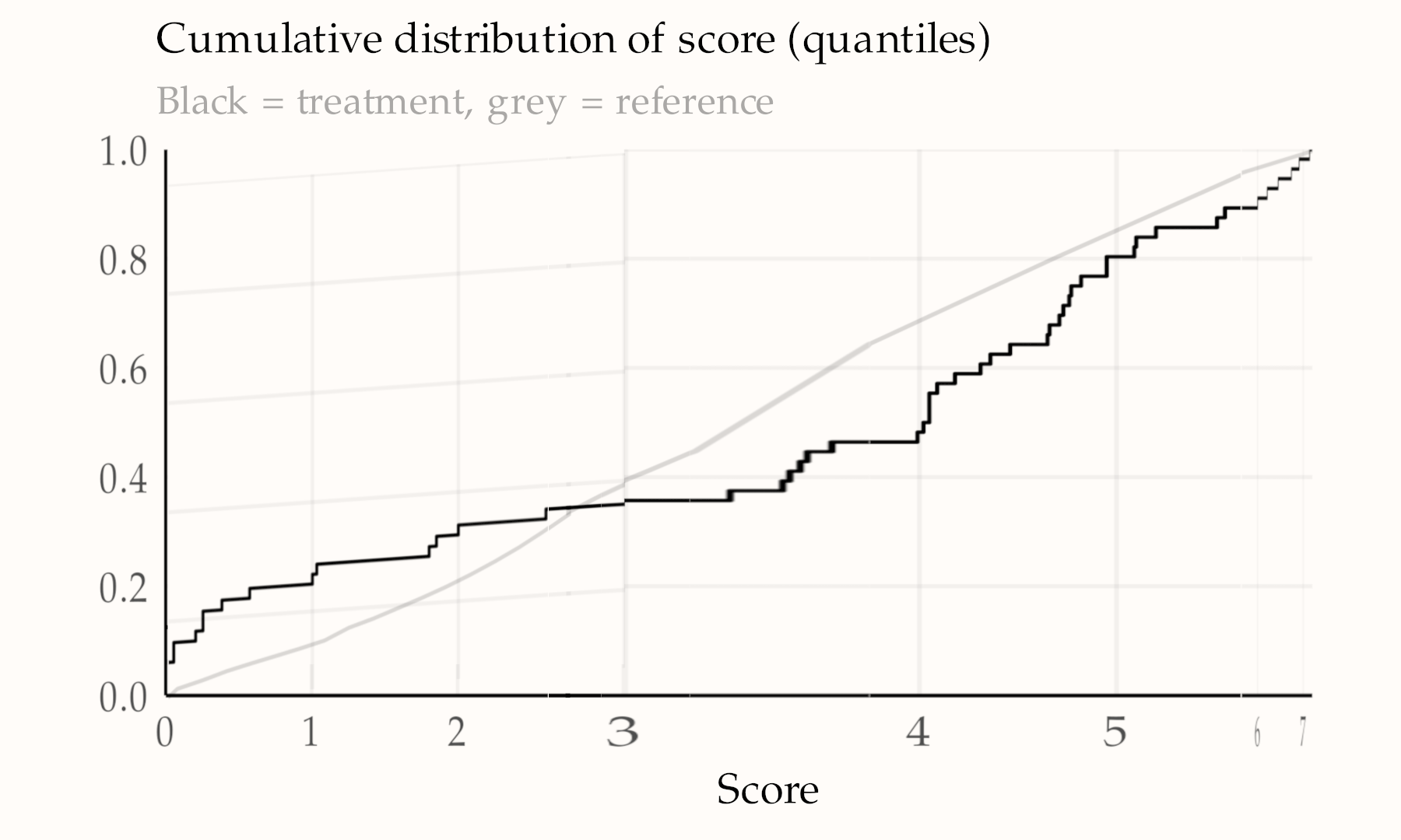
Clearly, I’m not very good at this. Fortunately, we can ask the computer to do this transformation instead. The result is what’s called a q-q plot, because the quantiles of the sample are plotted against the quantiles of the reference distribution.
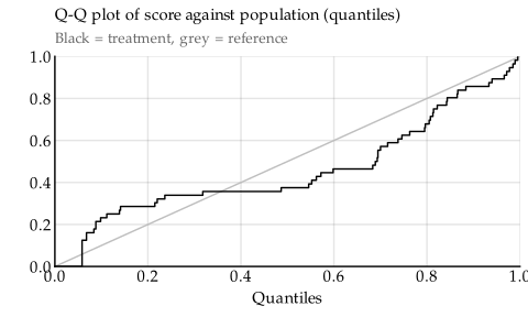
The q-q plot is a little harder to interpret than the raw distributions, mainly because it sacrifices information about the scale of the measurement. But when it comes to comparing distributions, the q-q plot does just as well as the raw distributions, only warped to be viewed from the perspective of the reference distribution.
That’s in fact what makes the q-q plot so useful when eyeballing differences: we don’t have to keep track of two distributions simultaneously, but instead we can focus on the relationship between the sample and the fixed diagonal. The q-q plot is also convenient for getting the data needed to perform Kuiper’s test: we simply record the largest distances under and over the diagonal.
More examples
In case you’re not yet convinced, here are some more examples of when we might want to perform a test like this.
- We have noticed that the birthdays’ of people at a social gathering seem to cluster toward the end of the year rather than be roughly uniformly distributed as would be expected from the general population. Maybe that’s just random chance, or there’s something at play which selects for people born at the end of the year.5 This was actually the motivating case for making the tool presented here. I didn’t have a way to test this hypothesis on the go, so I made one later when I got home. Yes, I’m that fun at parties.
- We have recorded the times between incidents in a software service. If these times can be drawn from an exponential distribution, that means the incidents occur independently of each other. That has huge consequences for how we choose to deal with them.6 But the reason I cared was for a forecasting competition.
- Someone said commits sizes are log-normally distributed. We can get some commit sizes from e.g. nginx and test if they agree with the log-normal distribution.
- From a previous article, we have the ages at which Supreme Court justices retire. We speculated these followed a Weibull distribution, but it would be nice to see if Kuiper’s test agrees.
- We find some data which we think corresponds to biweekly maxima of daily violations of Taiwanese airspace. If they are, they should fit a Fréchet or Gumbel distribution fairly well. If not, we might be looking at some other data than we thought.
Well, we can find out.
Birthdays
If we note down the birthdays as the (fractional) month of the year in which they happen, we can paste them into this Kuiper q-q plot tool. For the reference distribution we choose the uniform distribution between 0 and 12. We see on the q-q plot that the sample of birthdays dip below the reference diagonal, indicating birthdays are indeed clustered around the end of the year.
However, Kuiper’s test statistic comes back as 1.46, which is less than 1.620 and therefore not significant at the 10 % level. That means we can expect this distribution of birthdays through random chance alone.
Incident spacing
We count the number of days between each incident, and paste them into the same tool. The exponential distribution is the best fit, as indicated by the lowest aic value. Kuiper’s test statistic is also far from significant for the exponential distribution. It appears that these software incidents occur randomly, with no connection to each other.
Commit sizes
We count the number of lines added and removed in some recent commits in the nginx repository. We paste them into the tool. The log-normal distribution is the best fit, and the deviation from it is insignificant. It seems that commit sizes are log-normally distributed.
Justice retirement
You know the drill by now. Paste the numbers into the tool. Weibull is the best fit, and the test statistic shows the deviation is minor.
Airspace violations
We paste into the tool again. Fréchet is the best fit , and the test statistic shows only minor deviations from it. It’s interesting that Fréchet fit better than Gumbel – that is an indication that airspace violations are fat-tailed.
People scores
Finally, we come to the thing we wanted to do in the first place. Although now it’s a bit more complicated, because the reference distribution we have isn’t a theoretical distribution; it’s raw data that comes from state-collected population statistics. However, after we have pasted the sample into the tool, it allows us to also paste in a specific reference distribution through the Quantiles tab.
And look at that! The deviation is certainly significant. Kuiper’s test statistic is 2.79, which would be extremely unusual to get from random chance alone. Thus we can safely conclude that the treatment does make a difference to a person’s score. Whether or not that difference is good comes down to more nuanced jugment – remember that the difference was a greater chance of getting a very bad score, but also a greater chance of getting a good one.
Testing continuous distributions made easy
I have had the Kuiper Q-Q plot tool for a while now, and it’s come in handy very often. After all, this is the second most common hypothesis test I find myself wanting to perform.
The other kind of test I often need is effectively the same, except when the values are discrete. Creating that tool in a way that’s simple, generic, and still usable has proven to be slightly more of a challenge. Maybe some other time.